How to embed transparent Tableau visualizations into portals and apps. Should I do it?
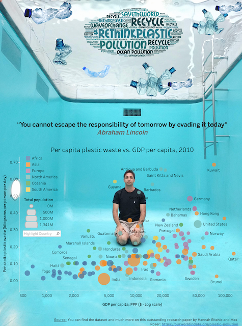
Back in 2018, Tableau released a much wanted feature to allow dataviz artists build dashboards with transparent backgrounds. The #datafam community quickly embraced this feature and started sharing some wicked vizzes. I’m not usually building fancy vizzes myself, but it did get me curious as well and led me to have my own creative artist moment:
Tableau’s out-of-the-box “Transparent Background” feature works nice and well when we are interacting with Tableau vizzes directly on Tableau Online GUI (or Server or Public), but some key questions I often hear are How to control transparency of visualizations when embedding in third-party apps and portals? Is it even possible? Can I control it in the app instead of Tableau?
And the short is yes to all :D
The reality is that it’s even easier to control the opacity (aka “transparency”) of a viz on an embedded solution than implementing it on the Tableau view itself. We can do it directly on the web app we are embedding the viz and it doesn’t require us to apply the transparency on the Tableau dasbhoard itself at all.
Important Note: there’s a small but important difference between the two approaches: If we implement it solely in Tableau, what we are essentially doing is keeping the actual marks on the viz fully visible (i.e. opacity = 1, unless explicitly set to something different), in addition to completely washing out the background and potentially also replacing it by a picture (e.g. just like my viz about Plastic Polution). In contrast, if we implement the opacity on the embedded viz container instead, we’re actually washing out the whole embedded object, including the marks. A few times a combination of these two techniques gives the final result we want. Which ones make more sense for YOUR use case?
How to control the opacity of a Tableau Embedded Viz Object?
The implementation couldn’t be easier. We just need to set the opacity style property of the container where the iframe containing the Tableau embedded viz (or in one of its parents). And naturally, we also need to have a parent object with the background image (thanks Anthony :). For example:
<div id=”vizContainer” style=”opacity: 0.8;”></div>
Does it even make sense to use transparency on visualizations?
To be honest, this is perhaps the most important question in this post.
The first time I saw this in action, it did make a lot of sense to me, as the webpage had a dark non-intrusive background and the artist wanted the end user to explore charts through a very immersive experience, where the viz background blended well with the parent container that was hosting it.
This “Scrollytelling” page, created by the talended folks at The Information Labs, executes this concept in style. Here the user can scroll through the page and see background images “flying in” and provides an additional level of (visual) isights about the topic in question (Forest fires across the globe), which complements the text and Tableau charts embedded in the page.
But this is one of the very few successful cases I’ve actually seen this techique being used in the field. The reality is that just because we CAN do things, it doesn’t mean that we should do it.
More often than not the use of vizzes with transparent backgrounds actually introduces a level of complexy and causes more harm then good. For example, users may get distracted from the core message we want to convey, perhaps because the information on the screen might not be clear and visible as we intended.
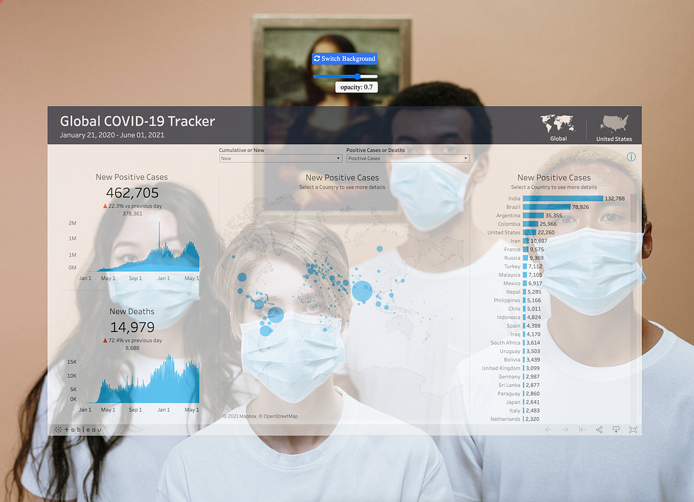
To give you a feel of technique in action, Have a look at this simple page I created and play around with the transparency settings and backgrounds to understand the impact of applying such. You may access it here.
Notice that the colors of the website background as well as of the viz itself in combination play a key role in helping us appreciate if transparency makes sense or not. For instance, in my opinion the opacity technique applying in combination with the background image in the example below wasn’t very successful:
Applying the opacity technique on embedded vizzes gives a lot of powers to app developers, but “with great power comes great responsibility”. To keep us honest, here’s a tip from Phil Naranjo (Product Manager at Tableau) from the blog post about sheet transparency on how to think of about this on a production scenario:
Data first. Worksheet transparency enables you to create beautiful, stunning dashboards. However, keep in mind that the subject of your data should always drive the formatting and analytical usefulness and readability should always come first. When choosing background images, ensure that those images aren’t obscuring axes, labels, or marks. For starters, stick with visually simpler background images with long stretches of uniform color like a blue sky, the sea, etc.
Having said that, as always our #datafam community never ceases to impress us with incredibly creative ways of leveraging new weapons we make at their disposal.
So, if you build websites or apps using this technique, please share in the comments below!

